Coven Vodka

Hired Guns Creative provided the product naming, branding, and packaging design for Coven, a vodka from Vancouver Island’s Arbutus Distillery.
THE BRIEF
Arbutus Distillery had three main objectives for the packaging of their inaugural product lineup:
Compete with the other brands in their competitive set. Many small craft distilleries’ products look amateur or homemade when compared with products from the large spirits producers. Arbutus wanted their products to stand tall against some of the most famous products in the industry and outperform products from their smaller, regional competitors.
Create brands for each of its products that are distinct from each of their other products and from the overall distillery brand. This approach will make it easy to make changes to one or two of their products down the road without having to redo the packaging of their entire product line.
Showcase a bit of the darker, wickeder side of our earthly existence without scaring consumers away.
THE APPROACH
Rather than trying to introduce a completely new concept to consumers, Richard created brands for Arbutus Distillery that are deeply rooted in history, redressing it, modernizing it, tweaking it, refining it. This parallels the approach that Arbutus’ distiller takes when he creates his products.
Richard used imagery and concepts for the Arbutus brands that consumers recognize on a deep, old level. Perhaps from old stories, dreams, or nightmares.
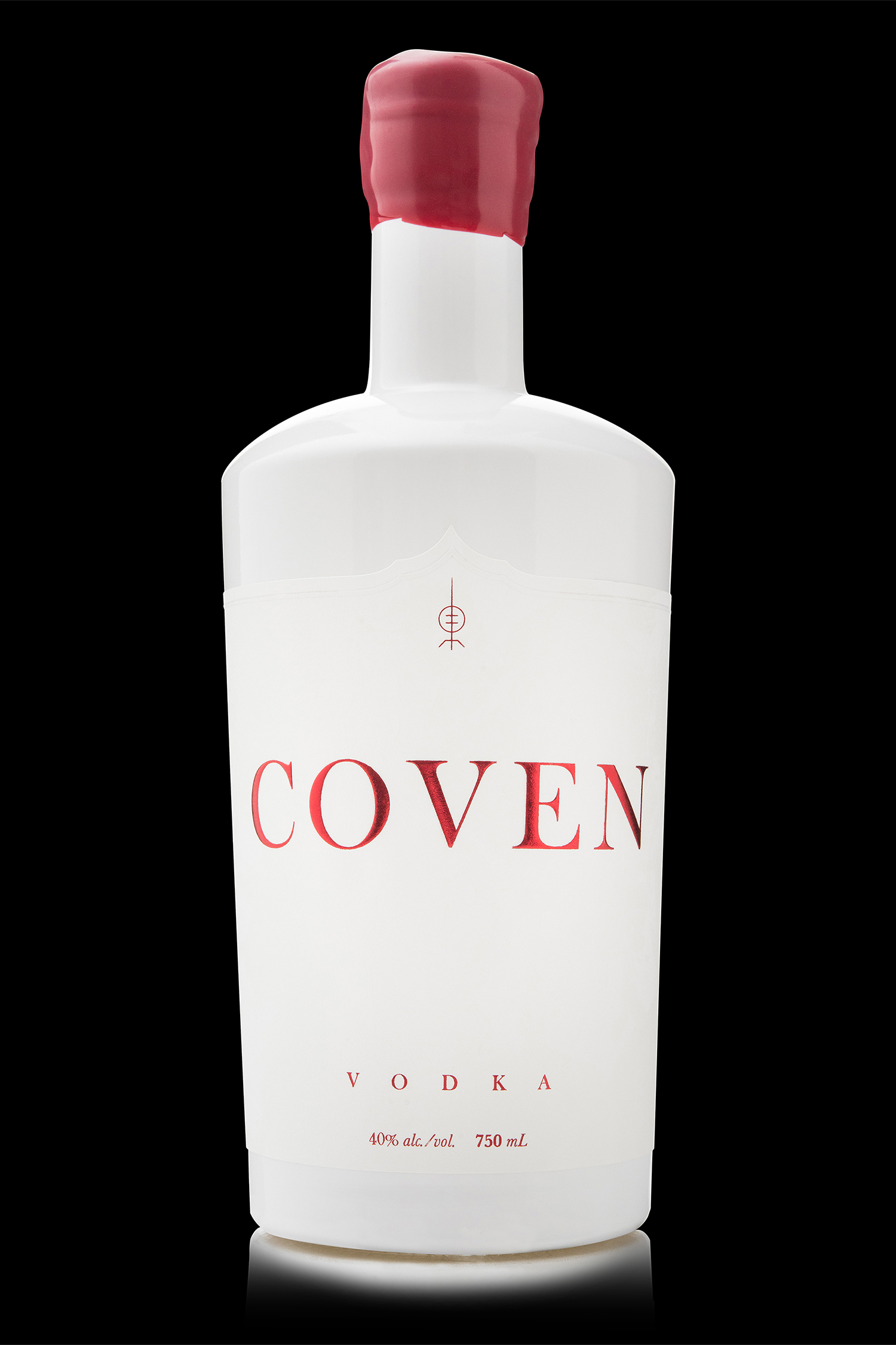
The name “Coven” was chosen for this product for a number of reasons. It speaks of a number of elements that could be advantageous to a vodka brand: gatherings, group activities, exclusivity, mysteriousness, and the possibility of a sexual component, (depending on how the evening turns out). “Coven” is also a play on the idea of spirits, as it can refer both to the category of alcohol and the spirit world. From a design perspective, “Coven” is a clean, balanced word that’s easy to work with on a graphic level. And, of course, there are the obvious criteria: it’s easy to spell, say, pronounce, read from a distance, and it was available to trademark.
Once the name was settled, the design challenge was all about how to get these concepts across in a visual way. Richard wanted to add a special element to the packaging – a 4th dimension, if you will, that engages customers once they’ve got the product home.
In the daytime, Coven is a simple, elegant package. It sits comfortably within its competitive set with several quality indicators: hand-dipped wax, die-cut label, foil and embossing details, and massive amounts of whitespace. In fact, the white frosted bottle is an extension of the label’s whitespace. These details give the consumer confidence; the packaging quickly communicates craft and quality.
But darkness changes everything.
When the lights go down, the ritual begins. At night, the glow-in-the-dark overprint emerges on the front label to show a gathering of witches: some creepy, some seductive… all of them dark and foreboding. The chaos of the nighttime scene is emphasized by the simple, minimalist design of the “daylight” label.

PRINTING & GLASS DETAILS
At Hired Guns Creative we stay on top of new and emerging printing and packaging technologies/techniques, filing them away for the right project. Coven was a case of matching a concept with a relatively uncommon printing technique. We worked hand in hand with the label printer to ensure that the label would work effectively in the dark.
For bottle selection, we were limited to stock bottle shapes because Arbutus Distillery isn’t large enough (yet) to warrant custom glass. We chose a bottle that was different than the other stock bottles commonly used in their competitive set, likely because it is a bit more expensive than the lower-end options. It is made of higher quality, thicker glass and reinforces the “craft” part of the craft distillery image that Arbutus Distillery is cultivating. It has a sexy shape and a lot of surface area to work with when designing labels. Also, it’s suitable for the entire range of products that they have planned in the future (gin, absinthe, whiskey, etc.)
BACK LABEL COPY
Shrouded in the heavy mists of the West Coast, a timeless rite enchants those who seek a greater spirit. Initiation requires strict dedication to the craft. There is power in numbers, so gather together because when the light fades, the ritual begins.
WE’VE BEEN WAITING FOR YOU


Print Marketing Design:

Recognition:
UC.Quarterly – print publication, produced by Under Consideration.
Creative Bloq: 5 Big Trends in Spirits Packaging for 2014
2014 Applied Arts Award in the category of Packaging Design for Beer/Wine/Spirits
2014 DieLine Award in the category of Packaging Design for Spirits
Design Edge – Creatives Choose: Best work of 2014