JOAQUIN'S INFERNO
PHASE 1 - CONCEPTS & MOOD BOARDS
MAR 19. 2019
Concept 1 : Fire Tempered - SELECTED
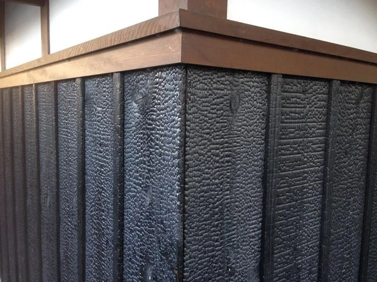
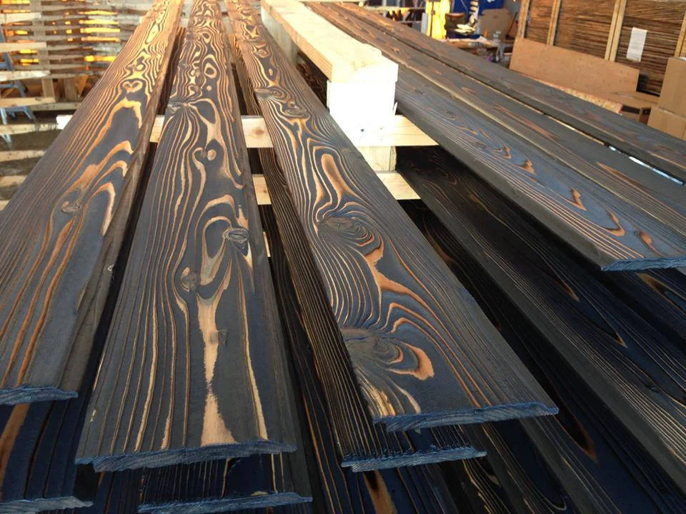
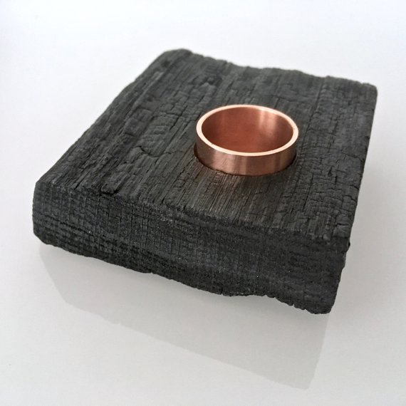
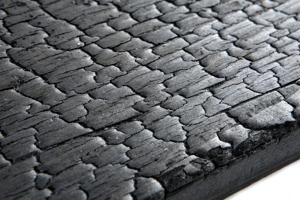
Yakisugi (焼杉) is a traditional Japanese method of wood preservation. Yaki means to heat with fire, and sugi is cypress. By charring the wood it becomes waterproof and more durable. In a sense, the burning makes the product stronger. We are interested in blind embossing a charred wood texture onto black stock to give a unique tactile experience. It would feel austere but organic. The charred wood could also be related to the charring of wine barrels. Another idea we are playing with is to include the glow of embers into the label or to look at the colour of magma for some of the elements.
Strong | Austere | Tactile

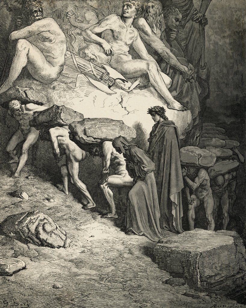
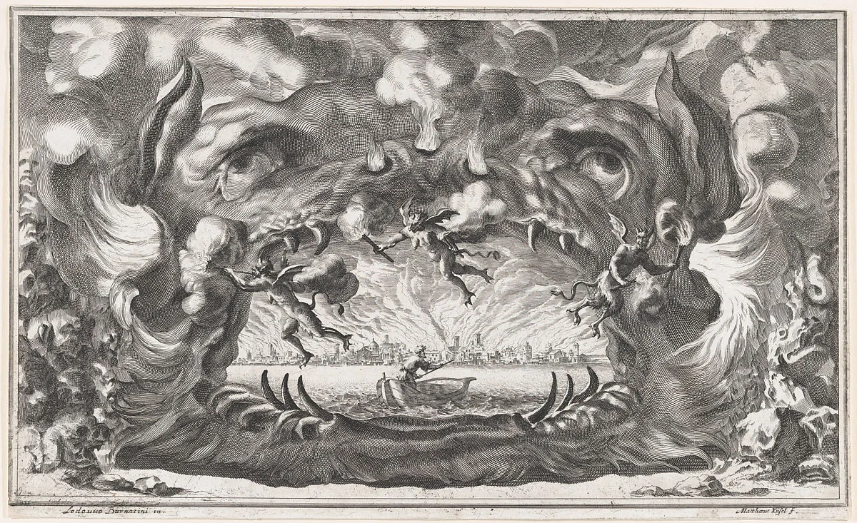
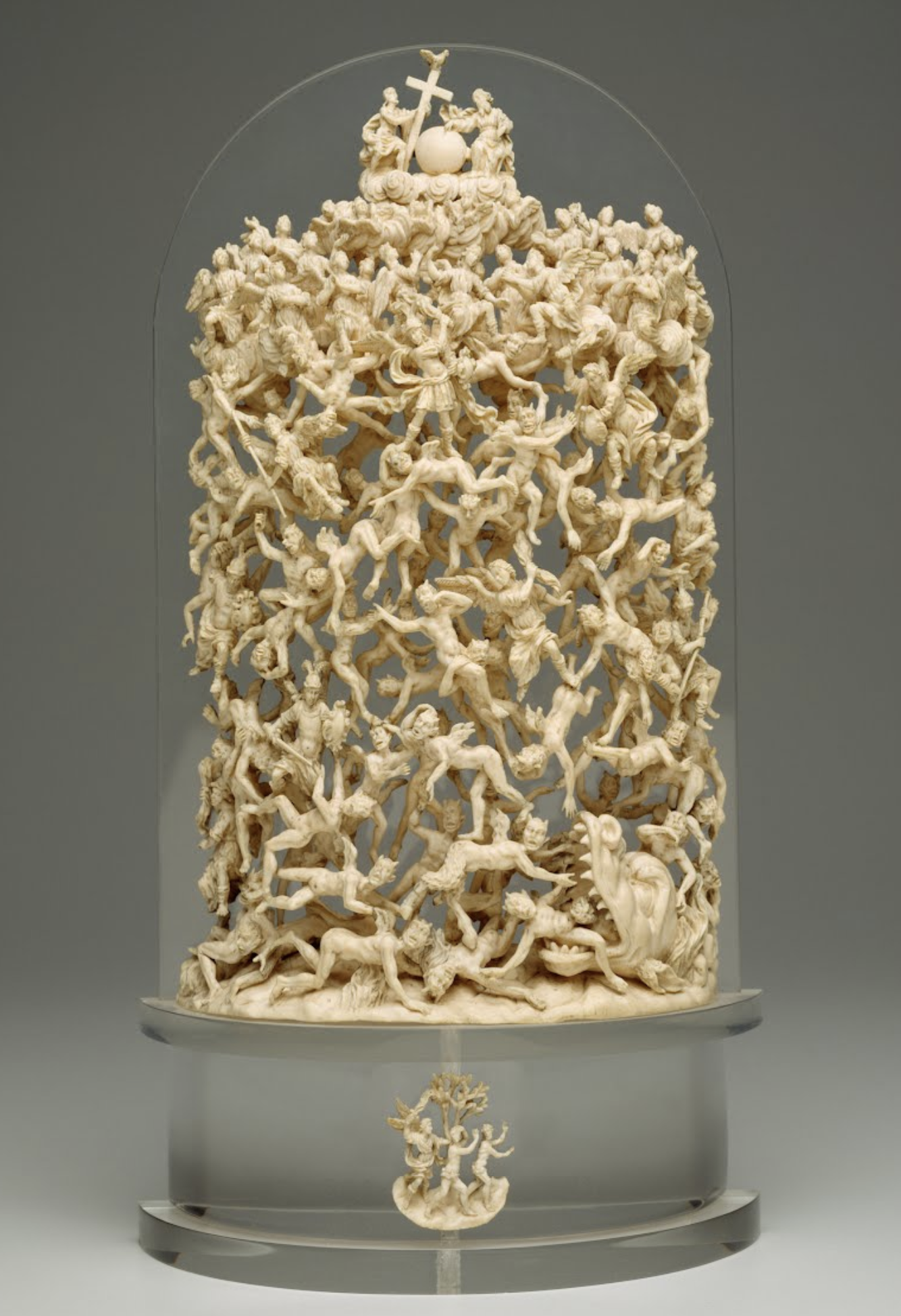
Concept 2 : Dante Complex
An allegorical map or a multilayered scene that we can fill with hidden details and small references. We can tell a number of smaller stories within a larger picture. Abstract ideas can be acted out by colourful characters. We would mix the absurd with the confrontational like Hieronymus Bosch. The layering of information will create series of unique impressions the more you examine the illustration.
Layered | Overwhelming | Transgressive


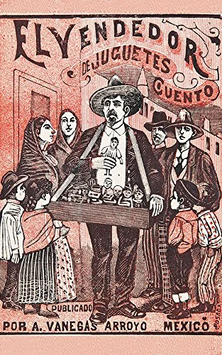
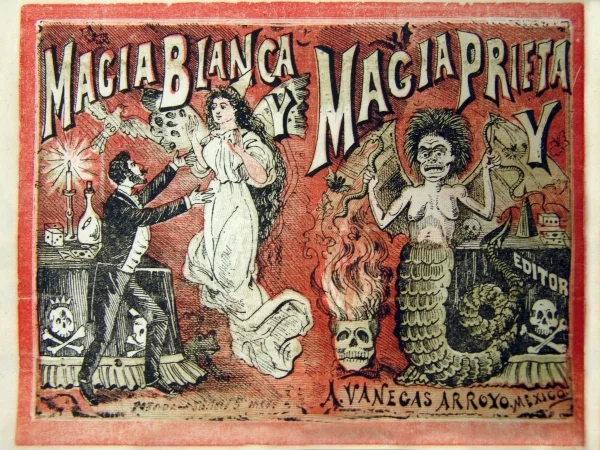
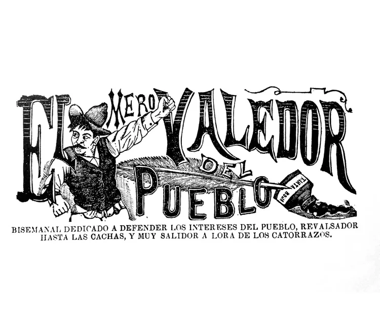
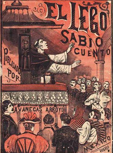
Concept 3 : Grabador Mexicano
The engravings of Manuel Manilla and Jose Guadalupe Posada are rich with a style and imagery that we don't see used in this market place. We would look to these images as a jumping off point and bring some of the handmade textures and expressive lettering into a more contemporary space. The colour palette would be bright but limited, allowing for bold differences with each varietal label. This style lends itself to a folk lore take on the story of Joaquin and the stories from the area.
Populist | Handmade | Expressive

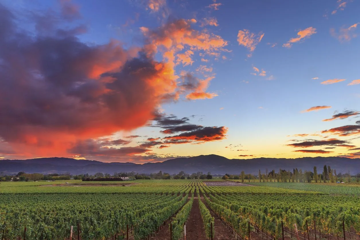
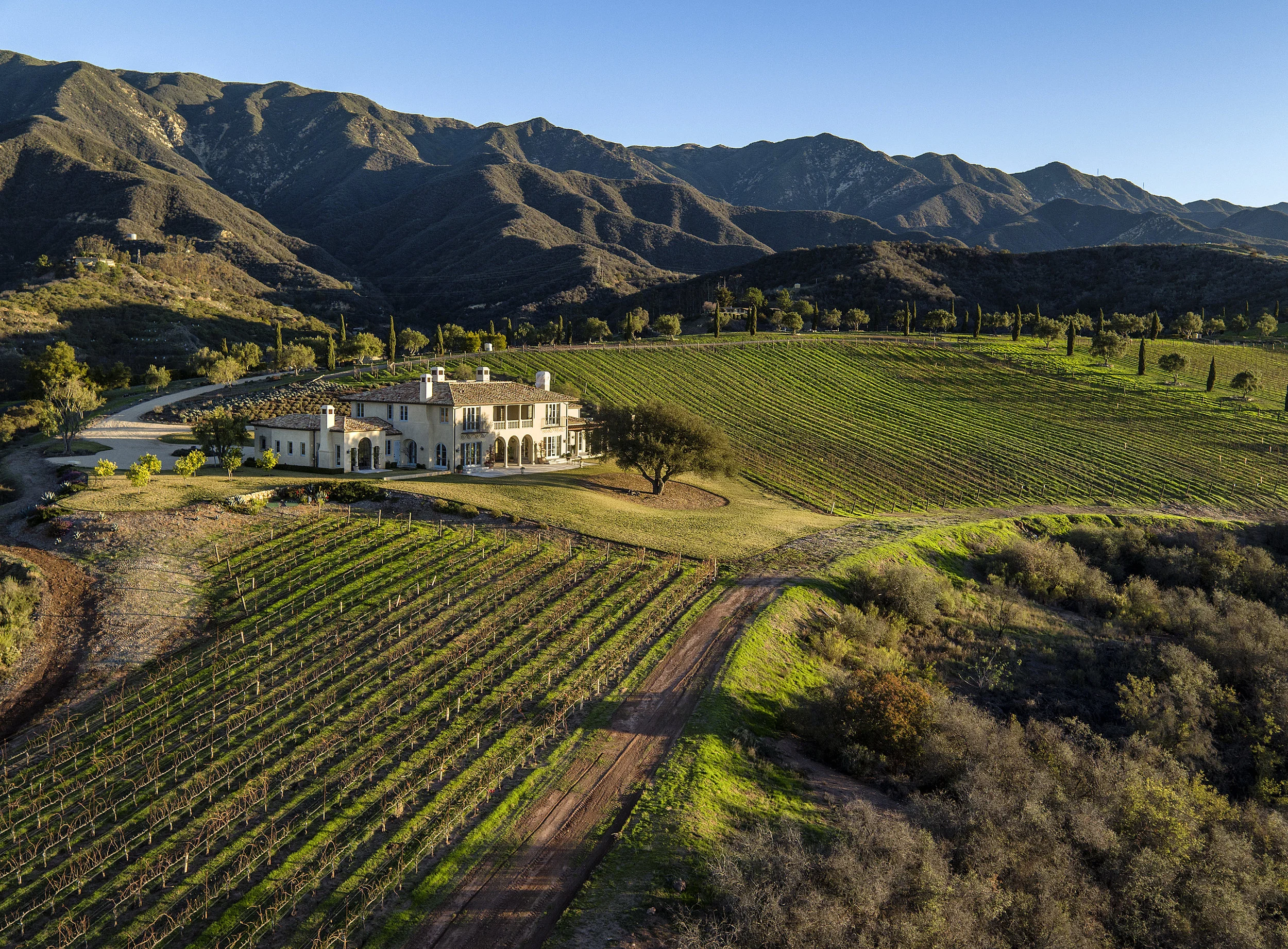
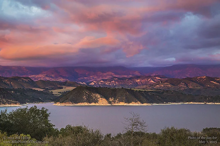
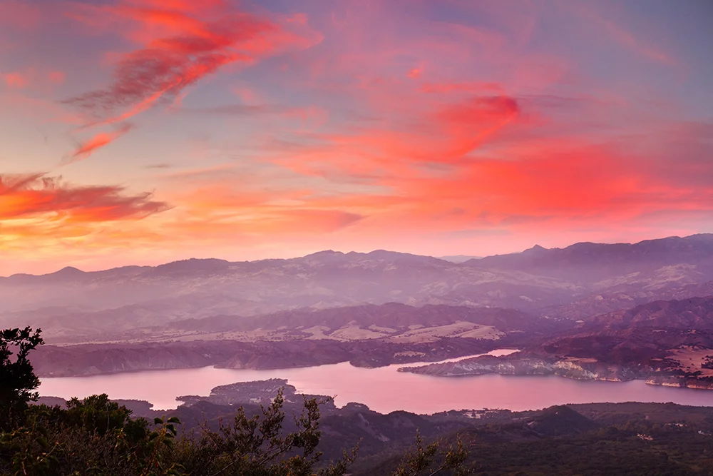
Concept 4 : Big Sky
Contrasting the rolling hills of Santa Barbara with a big blushing sunset sky, this concept focuses on the natural beauty of the area. This is a mythical ideal of California. A range of lush colours would work in harmony to create a dramatic sense of space and depth that would really stand out on the shelf.
Aspirational | Dreamlike | Dramatic
PHASE 2 - INITIAL SKETCH
APR 12. 2019
* Bright orange paper stock with black and grey printing as well as a charred wood pattern embossing
* Dramatic die-cut label
* Glowing typeface in orange foil with other details in foil as well
* Chunky char pattern
PHASE 3 - FROM RESEARCH TO PRODUCTION
APR 30. 2019
The sundrenched plateaus of Santa Barbara still hold the embers of Joaquin Cota’s passion. The tempered land is stronger for it. IGNITE THE INFERNO
PHASE 3 - REVISIONS, ROUND ONE
May 9.2019
CLIENT REQUEST: Logo typeface - can we see a moderately tempered down version and a highly tempered down version?
CLIENT REQUEST: Can we see what varietal looks like on the front label?
CLIENT REQUEST: Back label copy, can we add the words (SANJA COTA VINEYARD) to the first sentence so that it reads, “The sundrenched plateaus of Santa Barbara’s SANJA COTA VINEYARD still hold the embers of Joaquin Cota’s passion.“?
PHASE 3 - PHASE 3 - REVISIONS, ROUND TWO
May 26.2019
CLIENT REQUEST: Please pull everything together using the typography option that has the large decorative ascender and descender on the “J”