Fat Tug IPA

Much has been said about Driftwood Brewing‘s Fat Tug IPA. It’s considered by many to be the most popular IPA in the IPA-loving province of British Columbia (and it certainly has the awards to back that up.)
But there’s a bit of a dark side to this beer. Ask anyone who’s woken up after a night of sessioning it. You have to proceed with caution: it sneaks up on you.
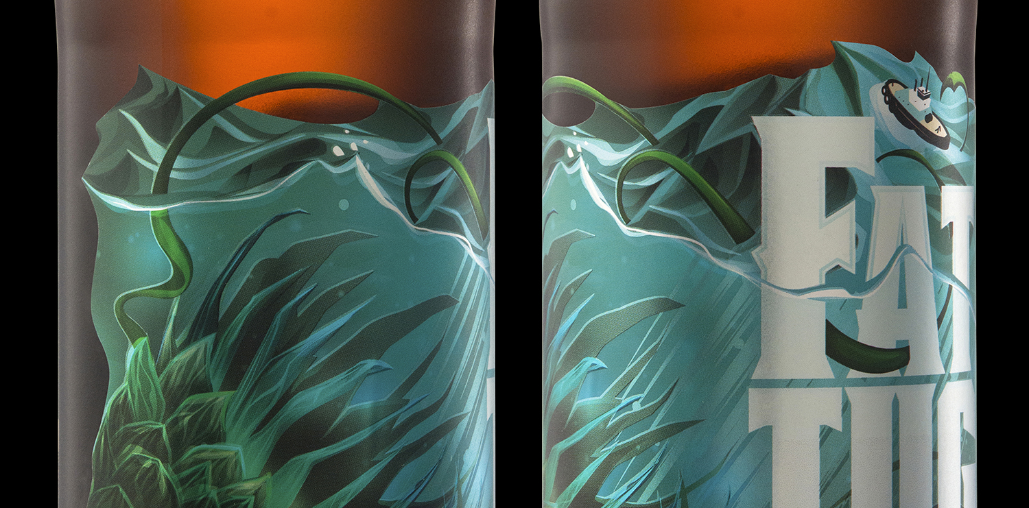
So how did we approach redesigning such an iconic beer? By going fully epic with the artwork! A wrap-around scene with an oceanic narrative, a die-cut shape, and a knock out… (On a beer label? Not something you see everyday!)


Poster:

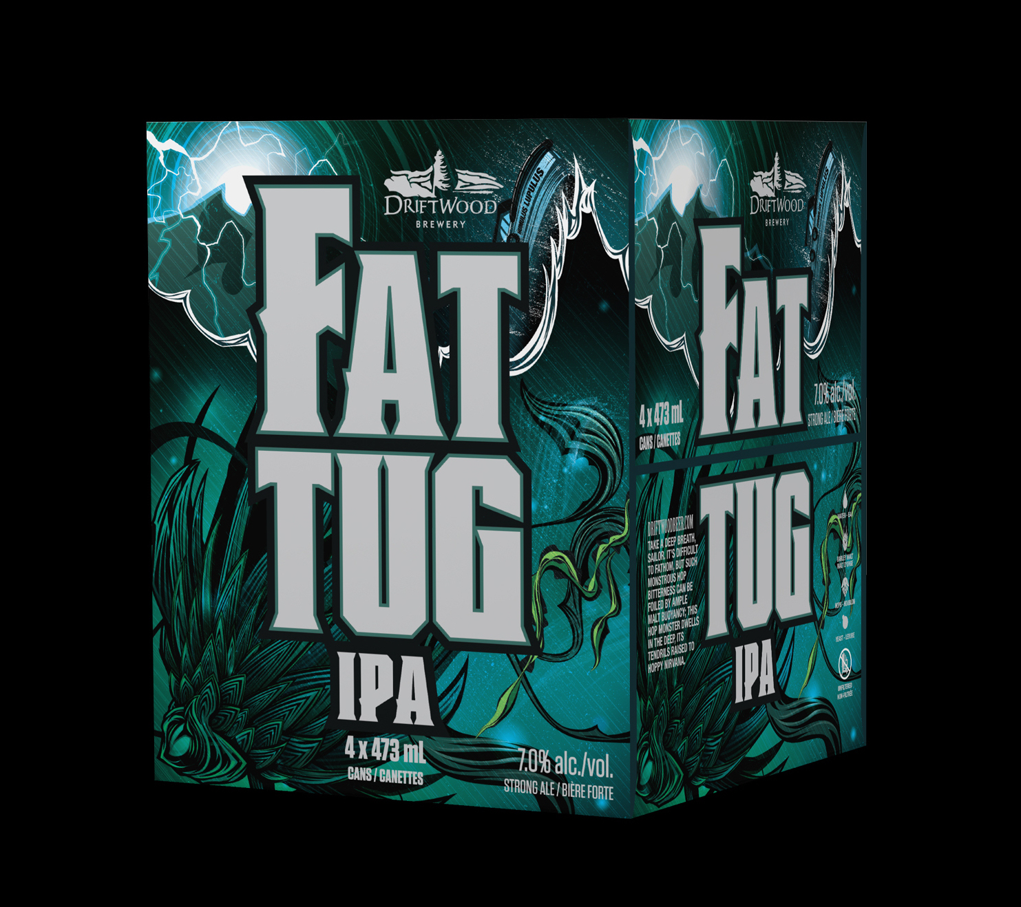
Boxes:

Recognition:
1st Place, CAMRA Vancouver 2014 Award for Best BC Beer Label Artwork and also for Best BC Beer (see… we told you they had the awards to back it up!)
Related Work:
Click any can or bottle to see the other packaging that we’ve designed for Driftwood Brewing.
