Highpoint Cider
For Highpoint Cider we built a crisp, clean brand that still carries a few rough edges. Based in Jackson Hole, Wyoming, Highpoint is close to Grand Teton National Park and we brought in some of that mountain spirit to this contemporary packaging approach.

The logo features a geometric mountain shape that brings with it an architectural upward motion towards its peak. Open and approachable typefaces are used to make this brand appealing in all markets.
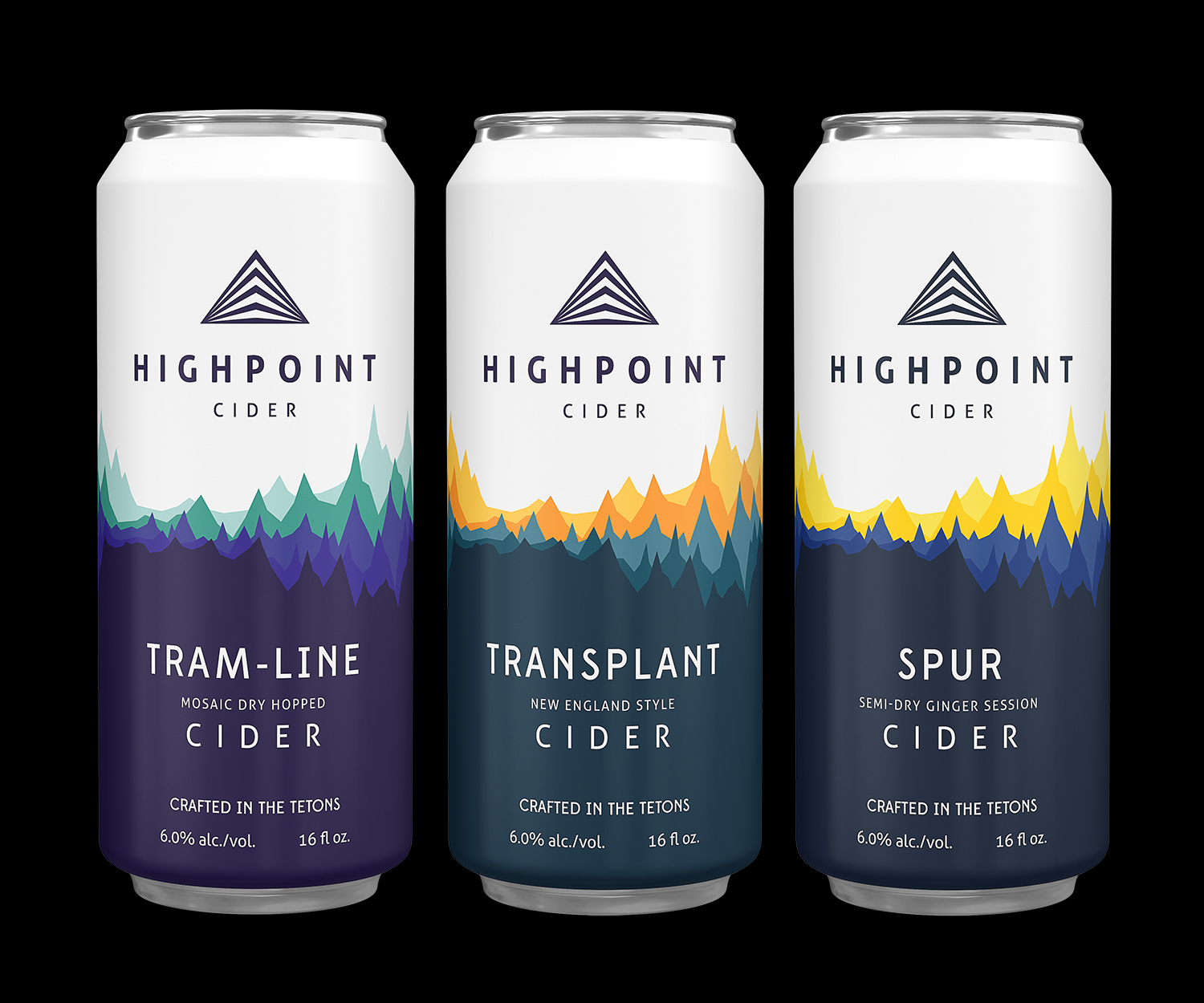
The can design employs a two tone colour scheme. The top halves are uniformly clean and white for cohesion across the product line up. This transitions down through a series of bright colours and a high saturation bottom half. Each release features its own colour strategy. The jagged forms of the illustrations could be seen as either exaggerated mountains or active sound waves carving across the centre of the cans.

The cans include a taste pyramid to help the consumer find their sweet spot on the cider scale.
