Mill Street Brewing’s 2017 Summer Brewpub Mixpack
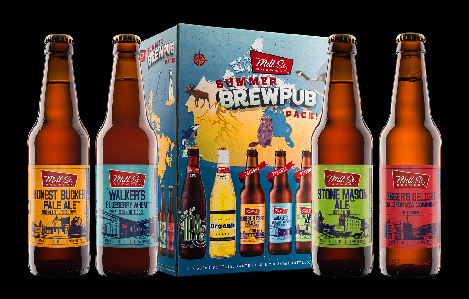
The task for Mill Street Brewery's new Summer Brewpub Pack was to create a mix-pack celebrating the 150th anniversary of Canada – a rare opportunity and challenge, given the number of breweries all working on the same concept, and all at the same time. Rather than celebrating the flag and its colours, Mill Street wanted to highlight a collection of beers brewed at their four brewpubs spread across the country.
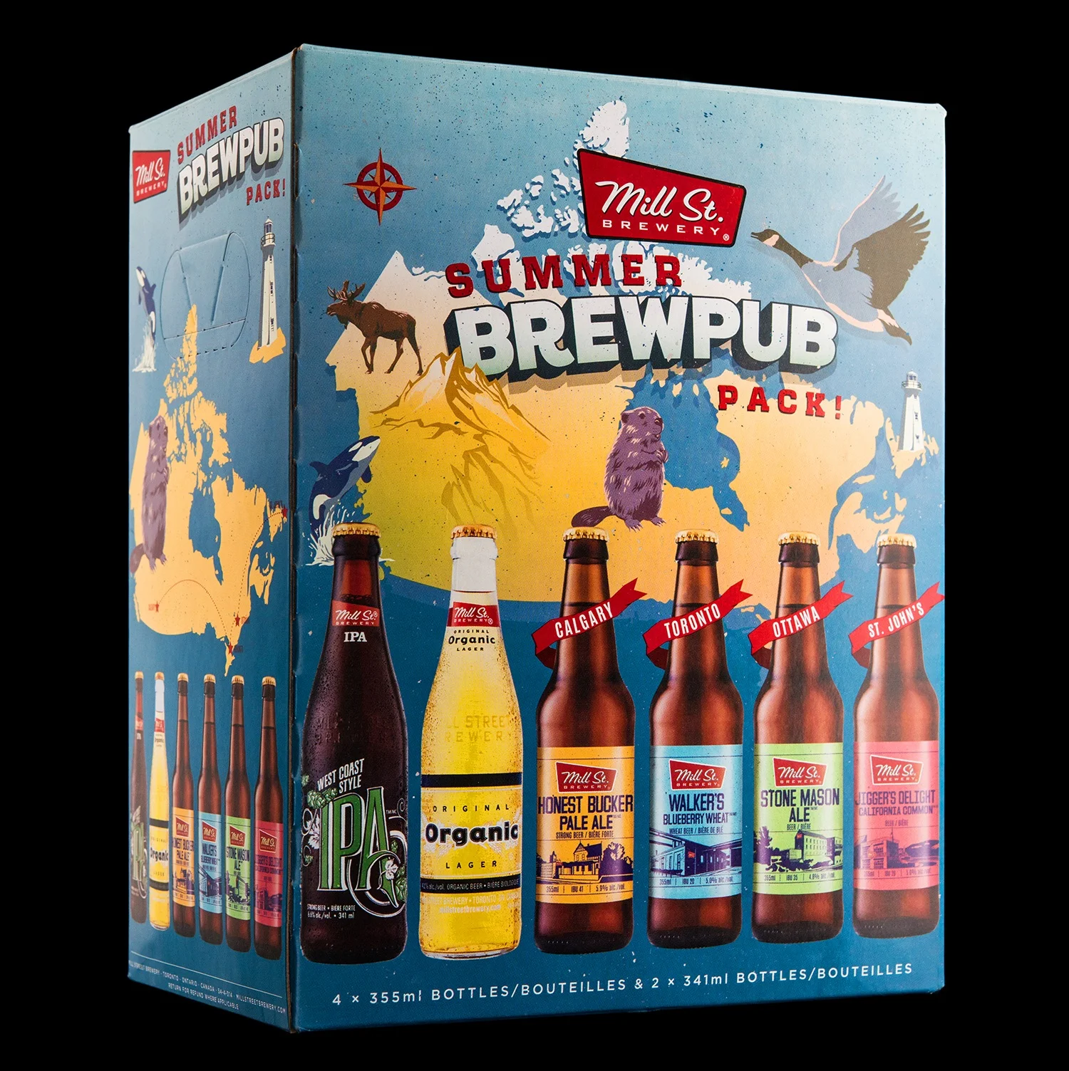
We decided to focus on the beautiful land and its iconic wildlife, all drawn in a classic illustration style, mixing flat and 3-D elements to interact with the typography and give the box a playful sense of perspective.

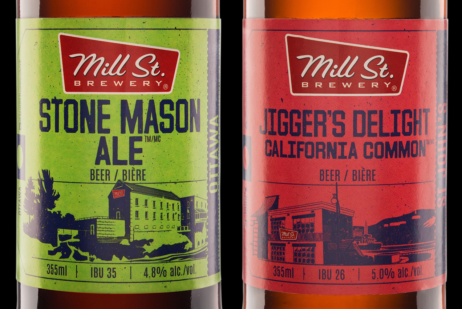
To showcase Mill Street’s presence across Canada, we designed four new beer labels, focusing on each brewpub’s signature recipe. With such different architecture from town to town, we decided to highlight the locations by putting the brewpubs front and centre, illustrated in a graphic one-colour style, with an additional pop of red for each building’s Mill Street sign. Tying together the lineup, we used design elements from luggage tags to emphasize the cross-Canada theme.