Sooke Oceanside Brewery
For Sooke Oceanside Brewery we were tasked with creating a brand world centred around a lineup of products with strong family resemblance, yet with enough flexibility to allow for custom illustrations for each product. We decided to unify the brand with a bold, graphic approach, drawing on the aesthetics of barber shops and advertising art from the 1930s.

For the label design system, we developed a hybrid approach: some of the framing and secondary design elements are consistent across the lineup, while others correspond to the iconic, central illustration. Custom typography, for example, is harmonized across the product lineup by letterform, and unified within the individual label by ornament. The labels all come together with a decorative die shape and an eye-catching colour palette.
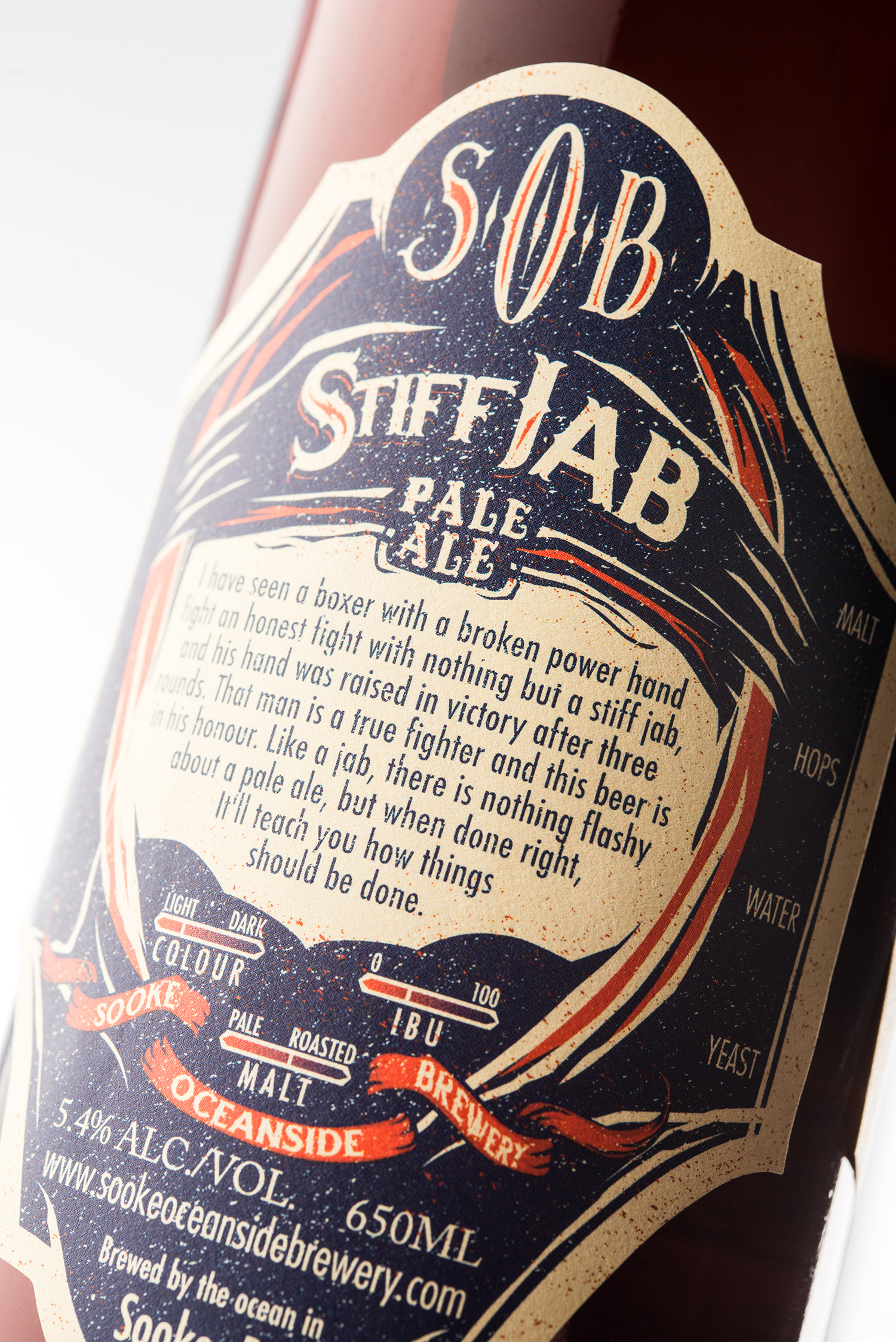
I have seen a boxer with a broken power hand fight an honest fight with nothing but a stiff jab, and his hand was raised in victory after three rounds. That man is a true fighter and this beer is in his honour. Like a jab, there is nothing flashy about a pale ale, but when done right, It’ll teach you how things should be done.

The design for Stiff Jab Pale Ale is inspired by boxing iconography, with an electrifying left jab punching through the frame. Lightning bolts are echoed through the typographical decoration and framing elements of the title.

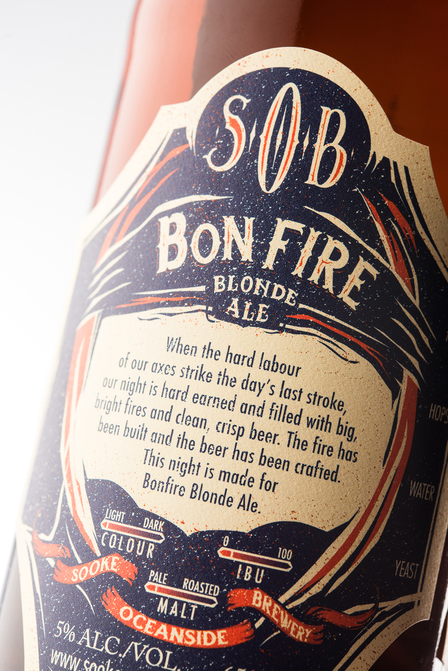
When the hard labour of our axes strike the day’s last stroke, our night is hard earned and filled with big, bright fires and clean, crisp beer. The fire has been built and the beer has been crafted. This night is made for Bonfire Blonde Ale.

The design for Bonfire Blonde is set around the roaring fires made in celebration after a hard day’s work. Sparks and smoke weave through the oval frame, while flames illuminate the title’s lettering.

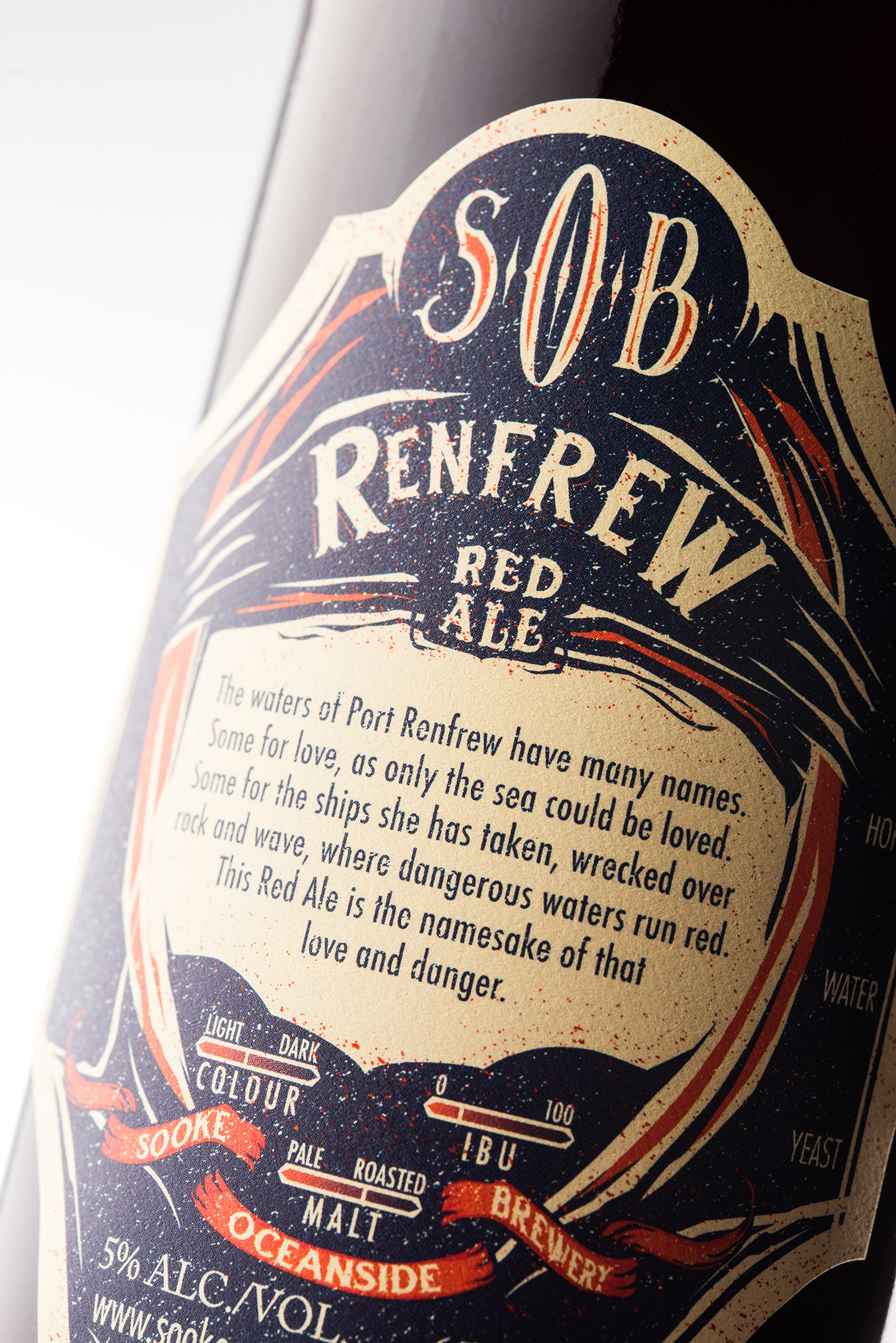
Port Renfrew has many names. Some for love, as only the sea could be loved. Some for the ships she has taken, wrecked over rock and wave, where dangerous waters run red. This Red Ale is the namesake of that love and danger. I prefer to call her Renfrew.

The design for Renfrew Red Ale pays tribute to the treacherous waters off Sooke’s coast, illustrating a Spanish galleon on the brink of capsize. The waves splash up the oval framework and echo through the title’s typography.

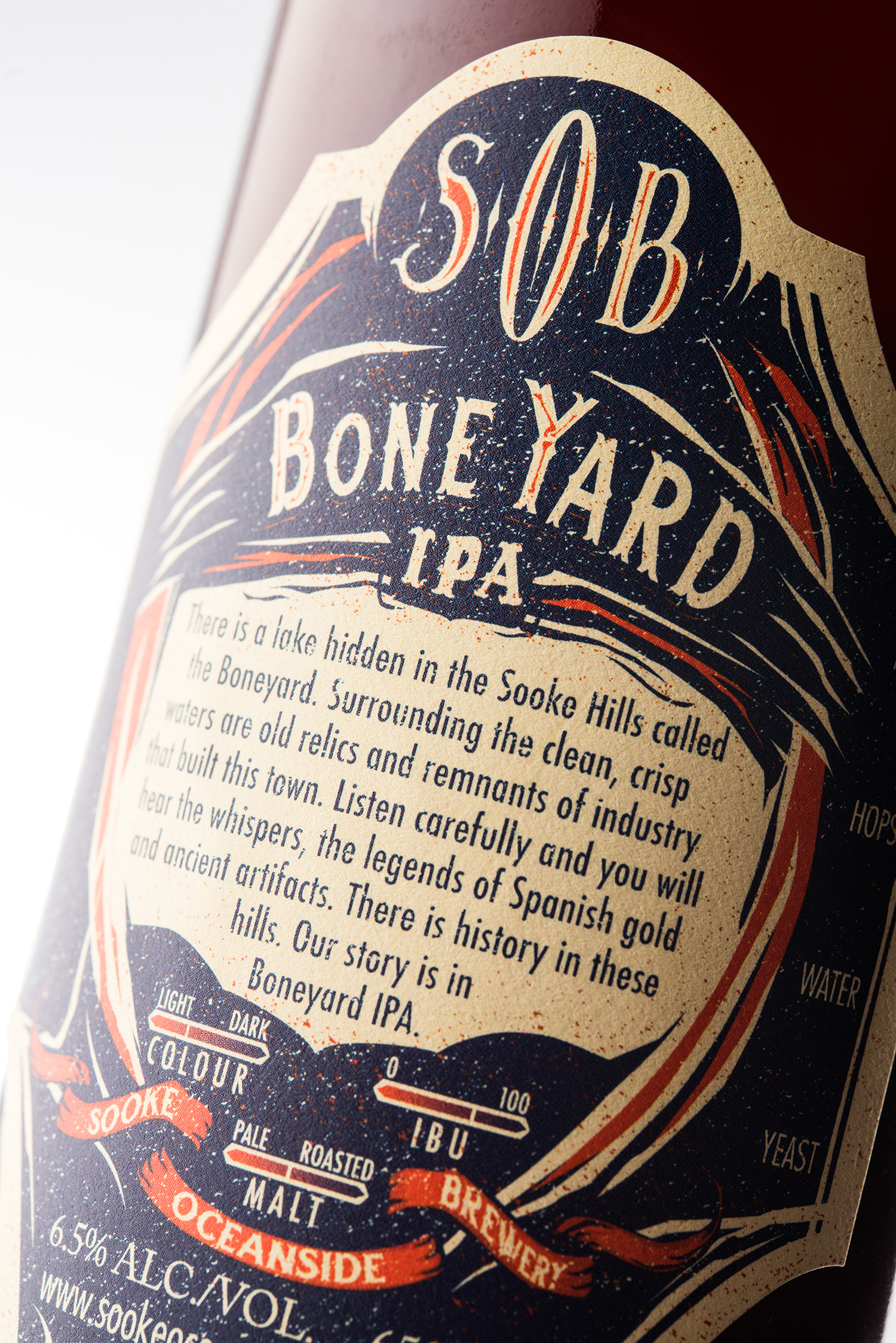
There is a lake hidden in the Sooke Hills called the Boneyard. Surrounding the clean, crisp waters are old relics and remnants of industry that built this town. Listen carefully and you will hear the whispers, the legends of Spanish gold and ancient artifacts. There is history in these hills. Our story is in Boneyard IPA.

The design for Boneyard IPA centers around the classic skull-and-crossbones as it would feature in the folktales of its namesake, Boneyard Lake. Illustrated bones are buried in the title’s letterforms and borders.