The Spirit of Tea

For The Spirit of Tea’s identity, we were tasked with bridging the gap between the kindred, yet disparate spheres of craft spirits and specialty teas to create a design that’s classical, timeless, and traditional, with sleek, contemporary touches. The central idea throughout this design is balance, aiming for the nexus point between modern and classic.
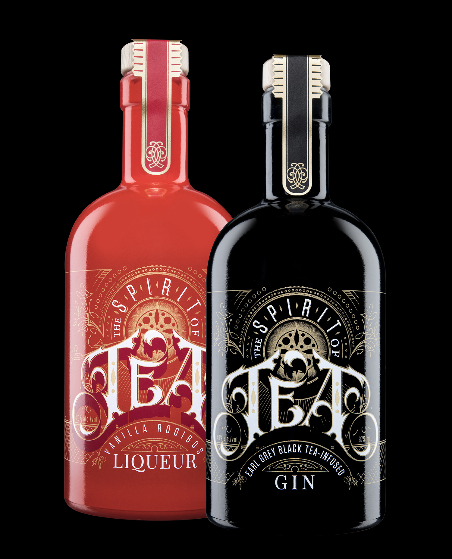
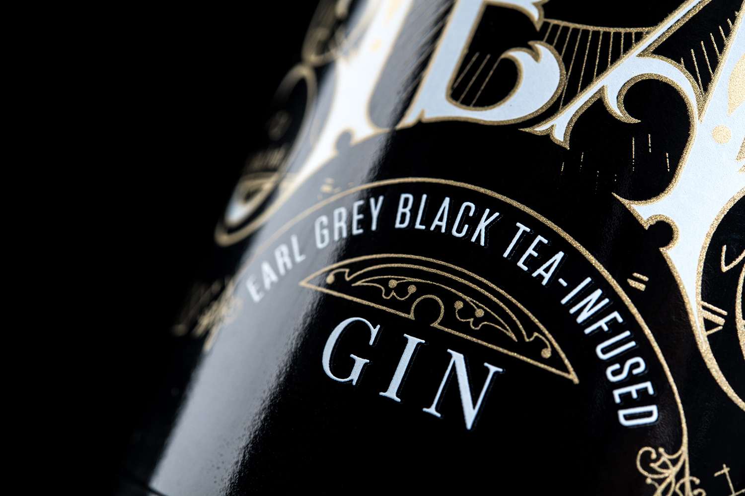
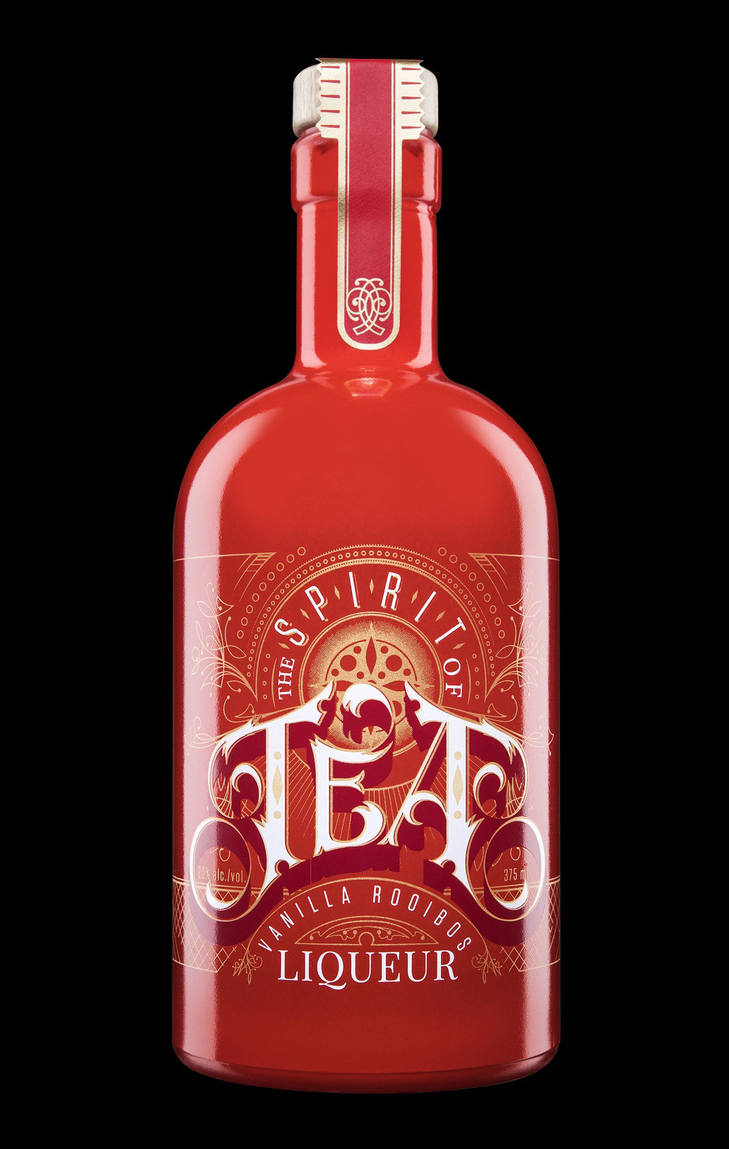
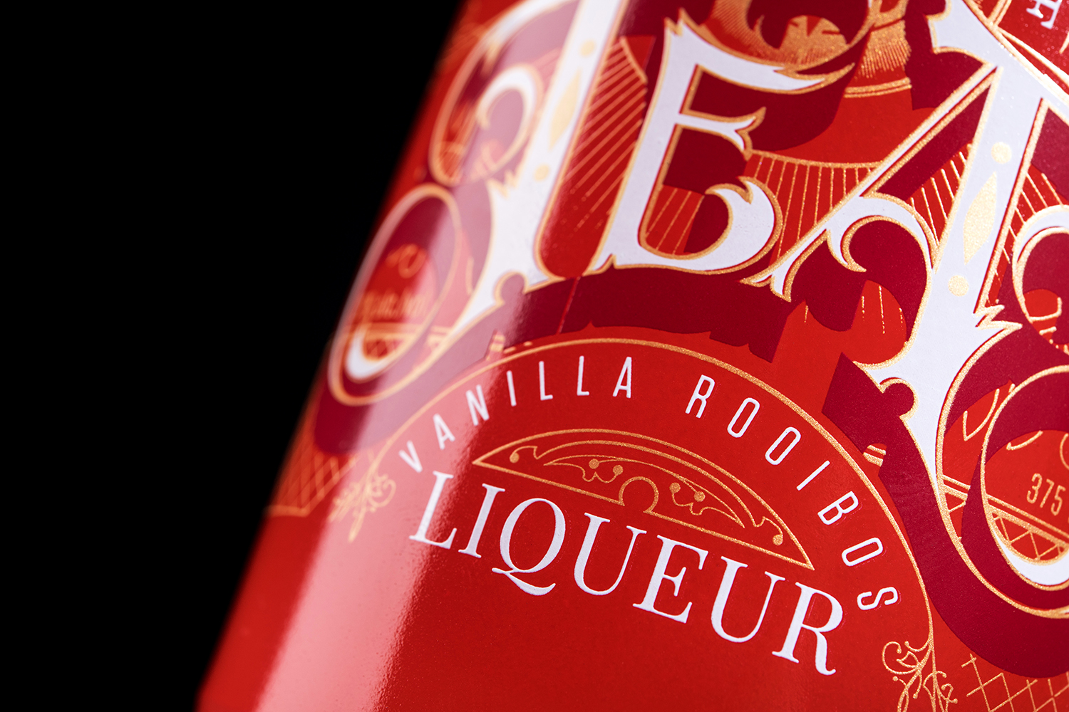
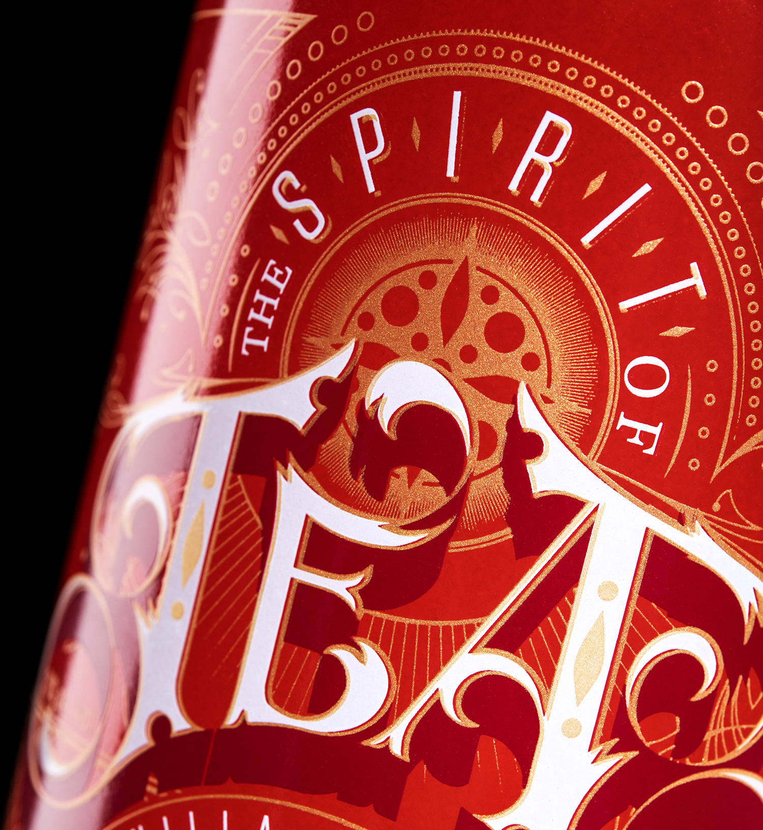
Every element of the bottle design is connected to the “spirit of tea,” drawing customers in to the story of the brand. The striking red and black hues are inspired by the colour palettes of red rooibos and earl grey teas respectively. The hand-illustrated Victorian-style letterforms, used for the type treatment of “TEA,” are a connection to the tea’s Victorian roots.

The design details in the type treatments and gold filigree used throughout the labels are meant to be visually stimulating and provide shelf appeal at every distance. The aesthetic is light and elegant, almost ethereal, from afar. Up close, it’s easy to get lost in the intricate details.

The Spirit of Tea is a brand embodied by interactions between teas and spirits, balancing both to create something distinct, and unique. The final design does the same: balancing modern humanist styles with classic Victorian styles; space and structure, to create a balanced brand representing the best of both worlds.