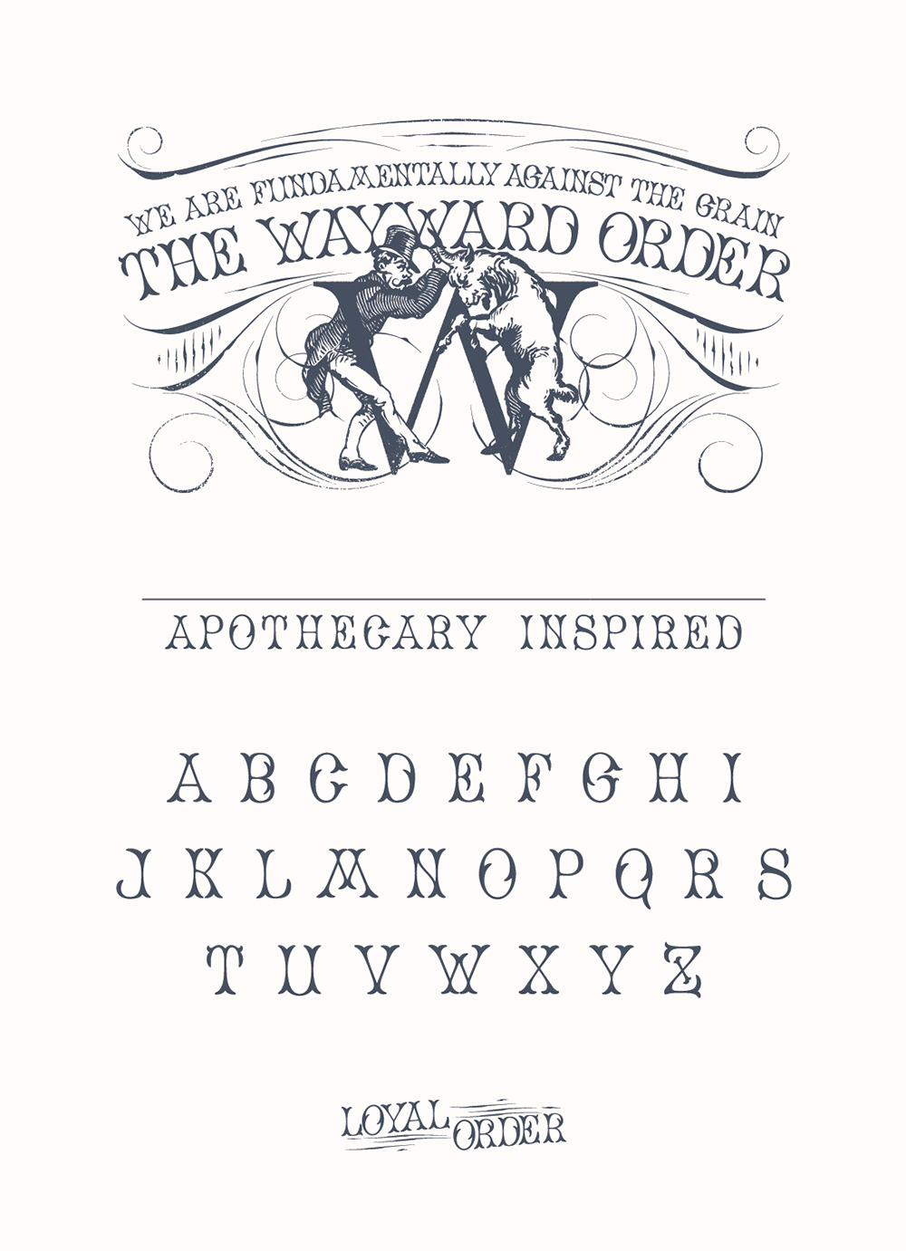
The Wayward Order
For the Wayward Order line, we were tasked with developing a label shell that evokes 19th Century apothecary while standing out with iconic design and a strong focal point.

To allow for an expandable product line, we developed a custom font with playful letterforms, thin strokes, and eye-catching organic serifs that create a subtle visual rhyme with the illustration’s horns, hooves and tailored shoes. With these letters, rubber stamps were created for each individual flavour; batch and ABV information is written by hand on every label. For the final touch, a beautiful dark wooden bar-top is sealed with ruffle-edged cap-strap and neckband.