Wayward Distillery

Wayward Distillery launched in 2014 as British Columbia’s only distillery that used honey as the base ingredient for all of their products. We helped them launch with naming, branding, and packaging design for their core products and their tier of small batch releases.
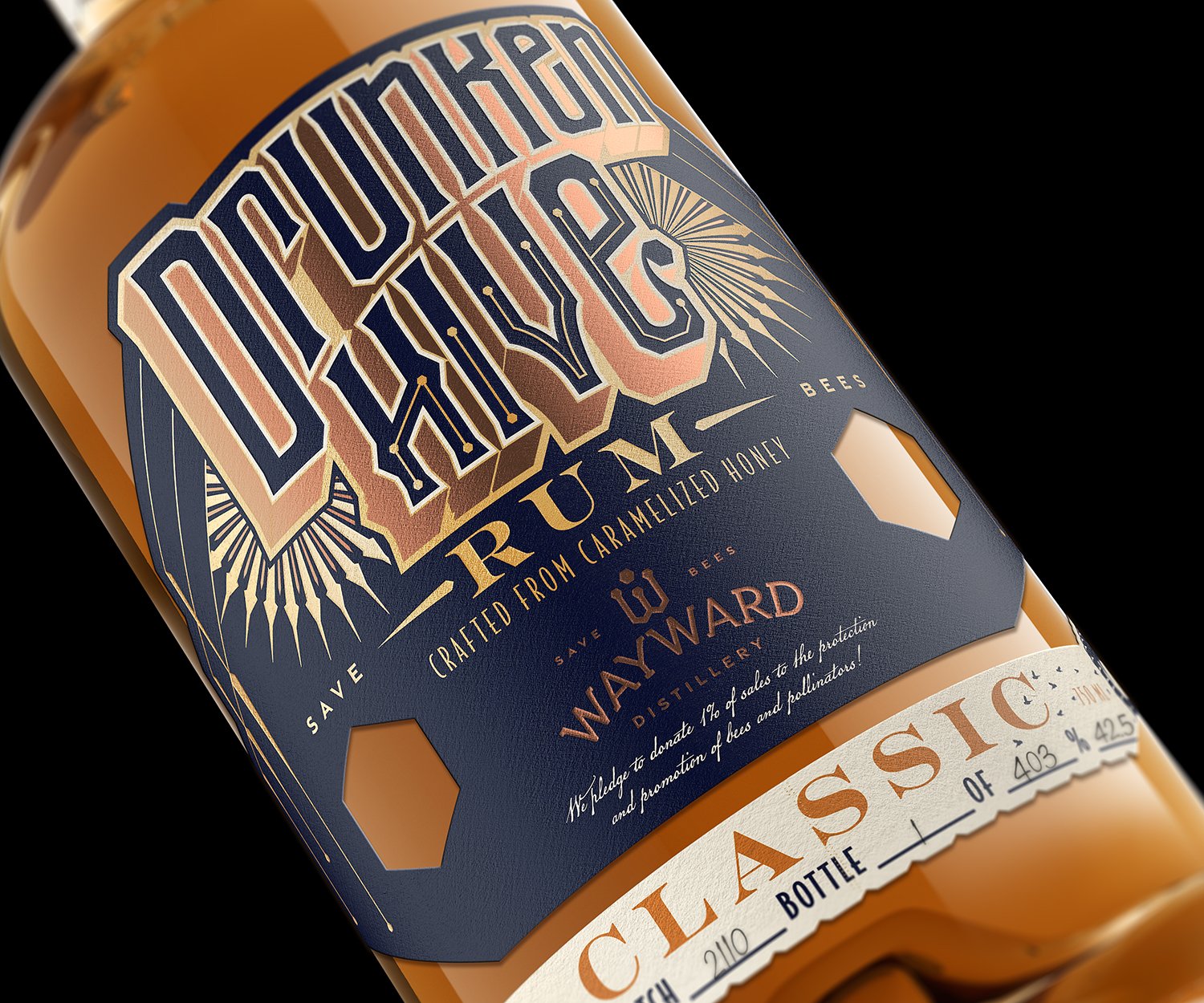
After seven years in business Wayward decided that it was time to update their branding and packaging design to something more approachable and reflective of the core brand values that they had honed since they first opened. This rebrand coincided with the introduction of grain-based products into their spirits lineup.

The market for craft spirits in British Columbia has grown and matured since Wayward opened their doors. (They were the 16th distillery to open in BC. By the end of 2021 there were 70.)
Wayward felt that the time had come to let go of their original brand elements and move towards branding and packaging that communicates a clear association with honey while speaking to an even wider craft spirits audience than their original products did.

We designed packaging for their core tier of products that utilizes custom typography and colour schemes for each product name but still keeps a cohesive look and feel across the whole tier.


This project also included the design of a more templated label for Wayward’s line of constantly changing small-batch releases.

Related Work:
The original branding and packaging design work we did when Wayward launched in 2014.

